Culture. Respect value
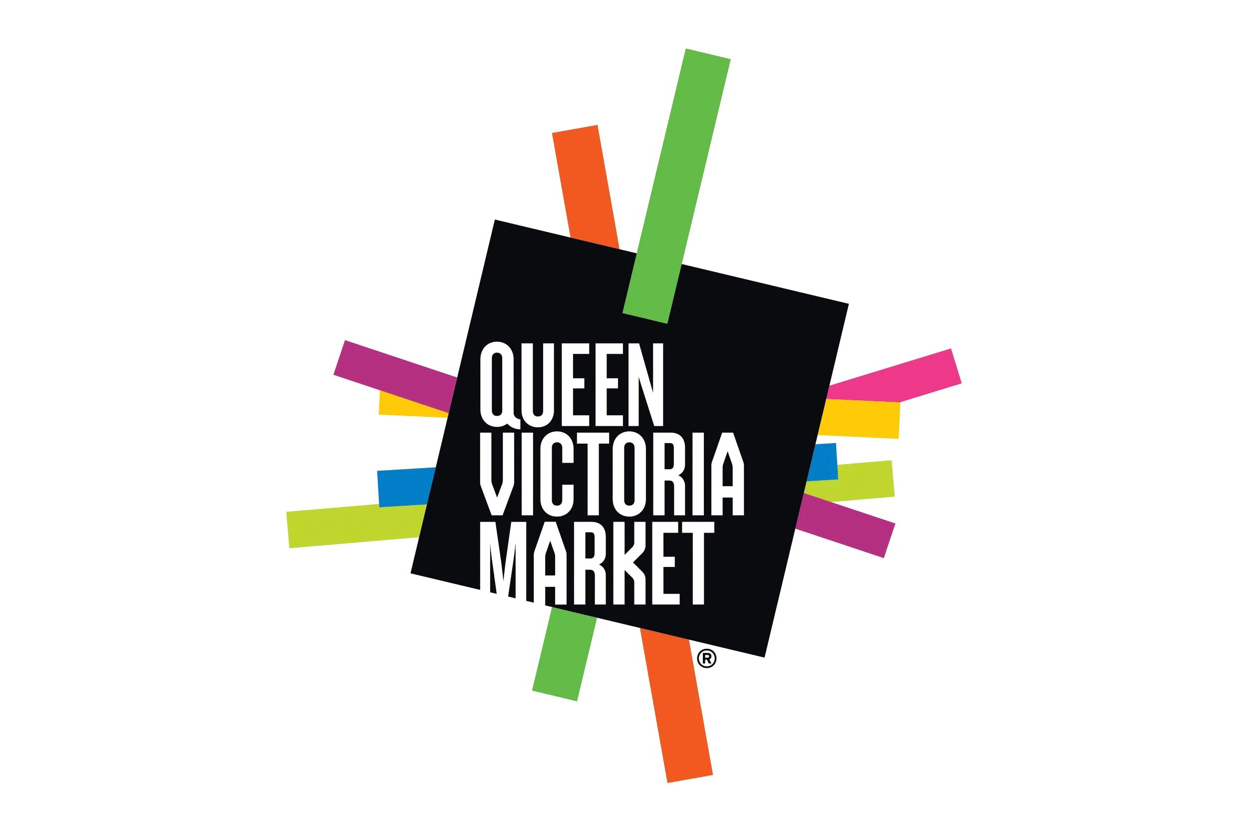
QUEEN VICTORIA MARKET
Queen Victoria Market’s refreshed brand, shaped through collaboration, celebrates its energy and diversity, strengthening sense of place while positioning the iconic destination as a vital, evolving part of Melbourne city.
STRATEGY
IDENTITY
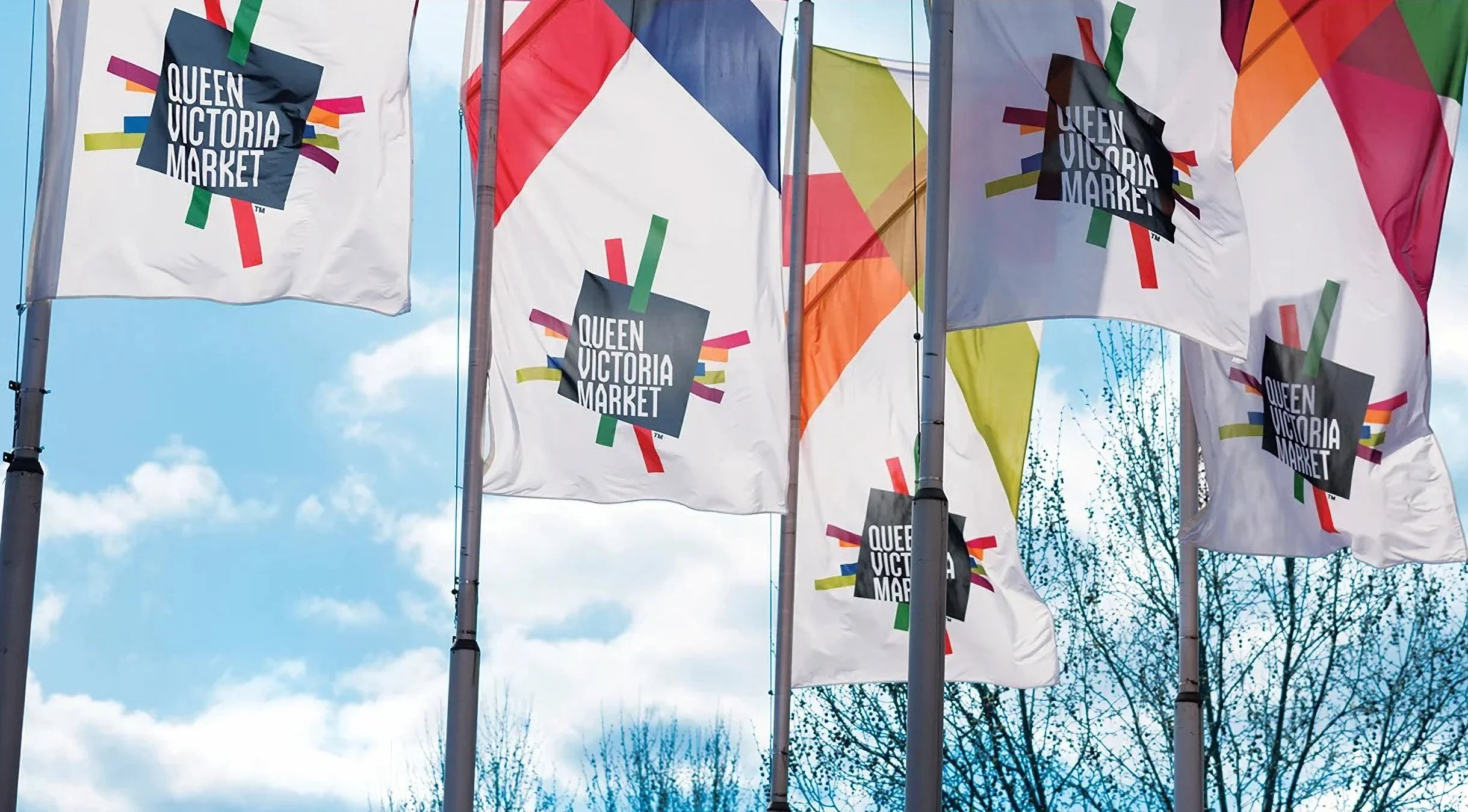
SIGNAGE
PLACEMAKING

IMPACT
No.1
Largest open - air market in the Southern hemisphere
150+
Vendors
10M
Visitors annually
STRATEGY
Fragmented identity undermined market’s vibrancy and heritage. Needed a cohesive brand expressing community, energy, history, and accessibility across all touchpoints. Emotional connection drives engagement. Translating market character, culture, and rhythm into a visual system creates meaningful, memorable experiences for visitors.
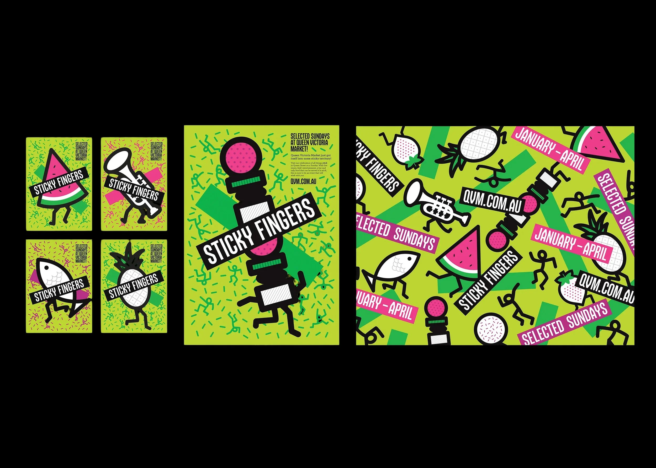
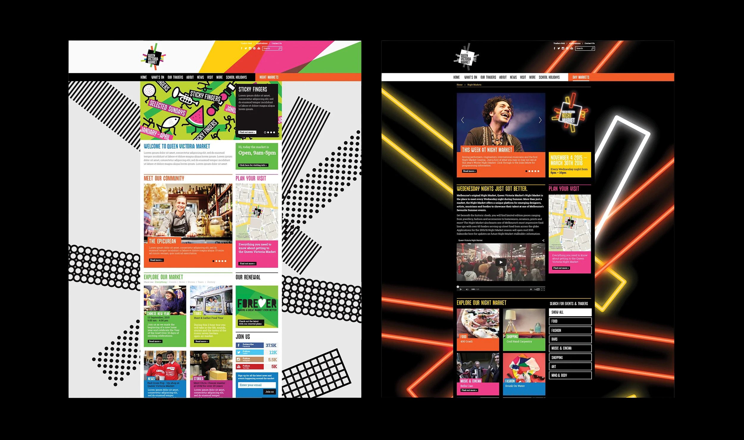
SOLUTION
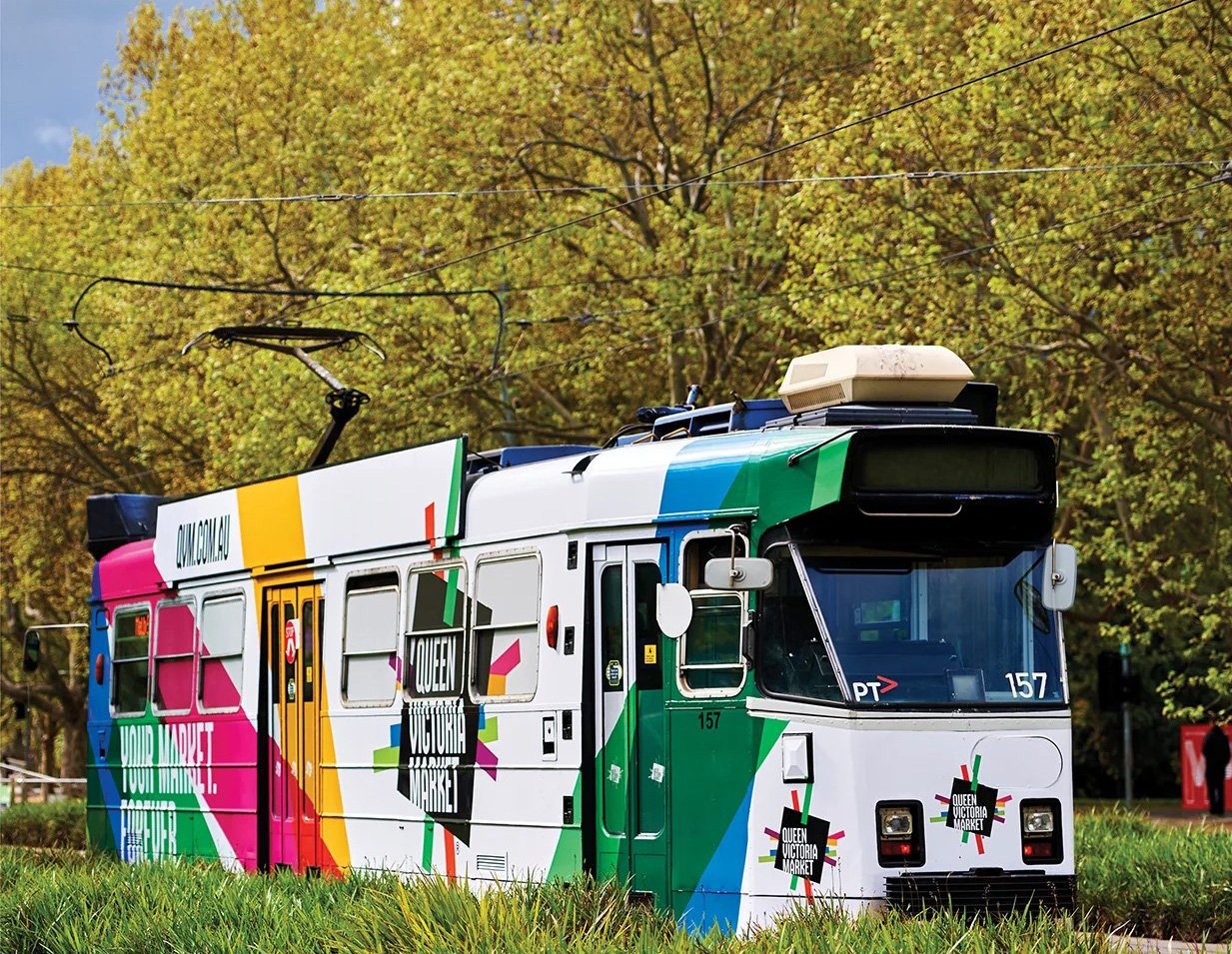
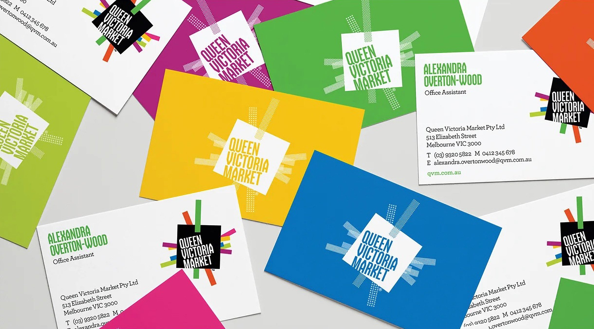
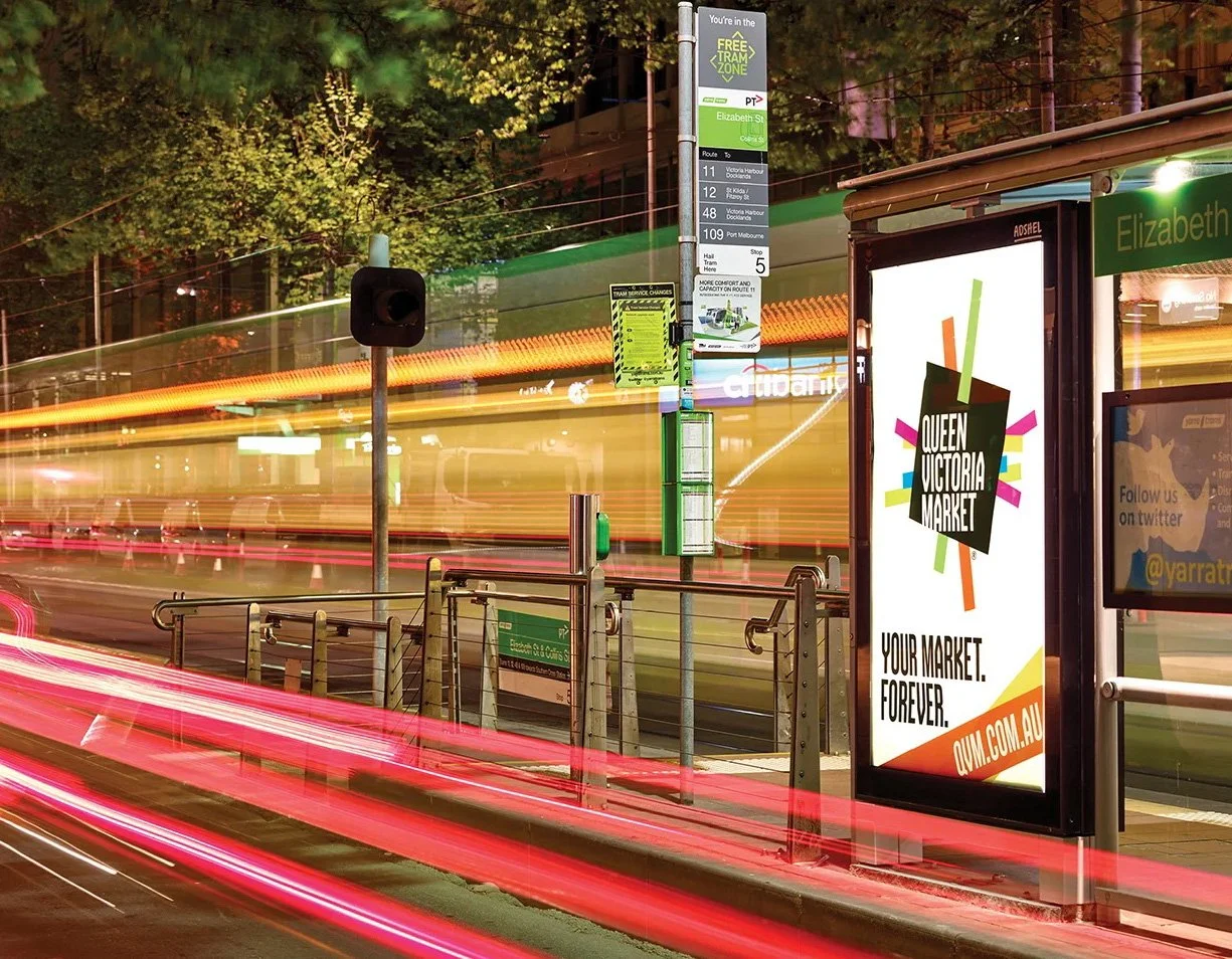
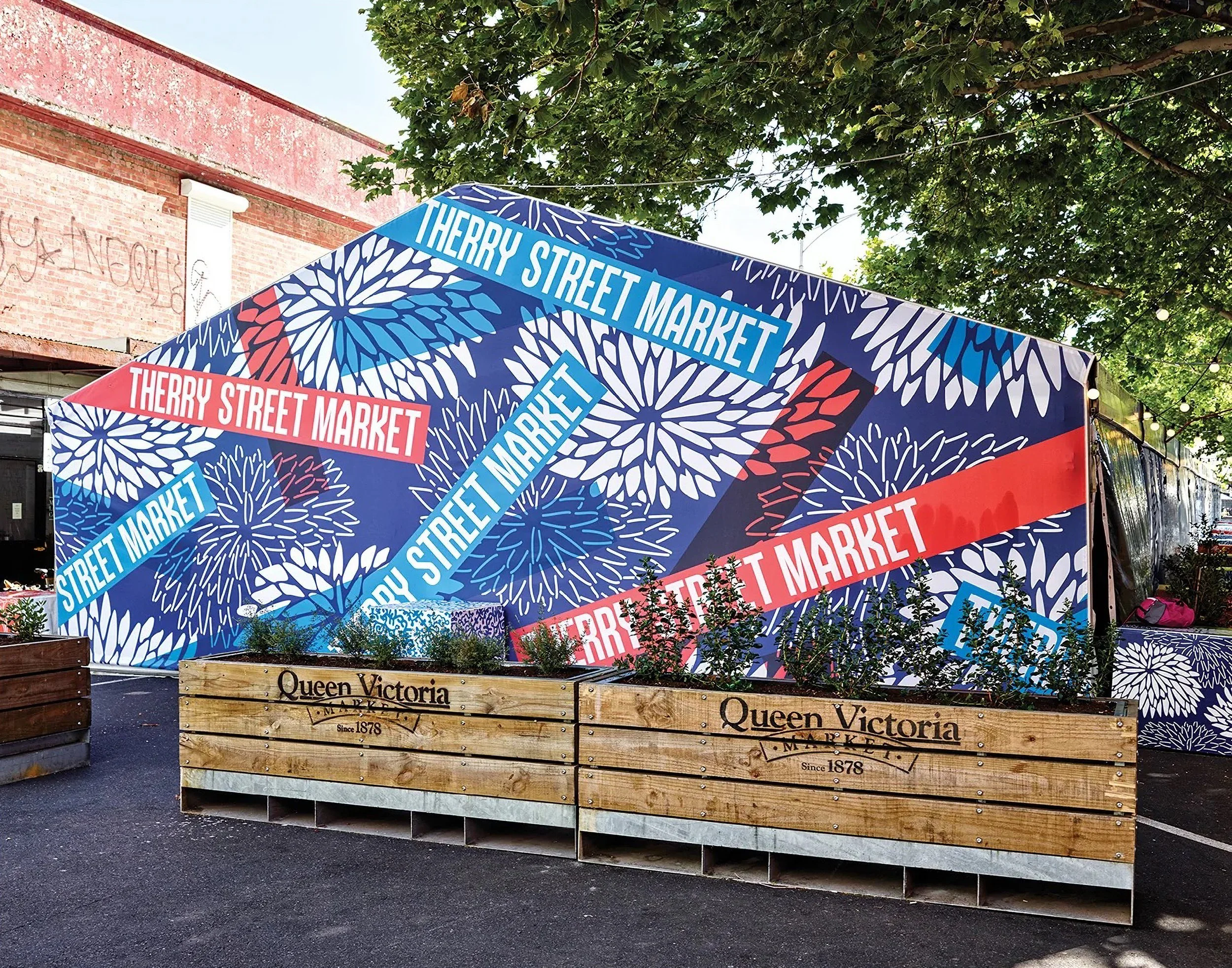
Bold typography, dynamic colours, and flexible graphics reflect movement, heritage, and energy. Applied consistently across signage, digital, and communications for cohesion.
VALUE
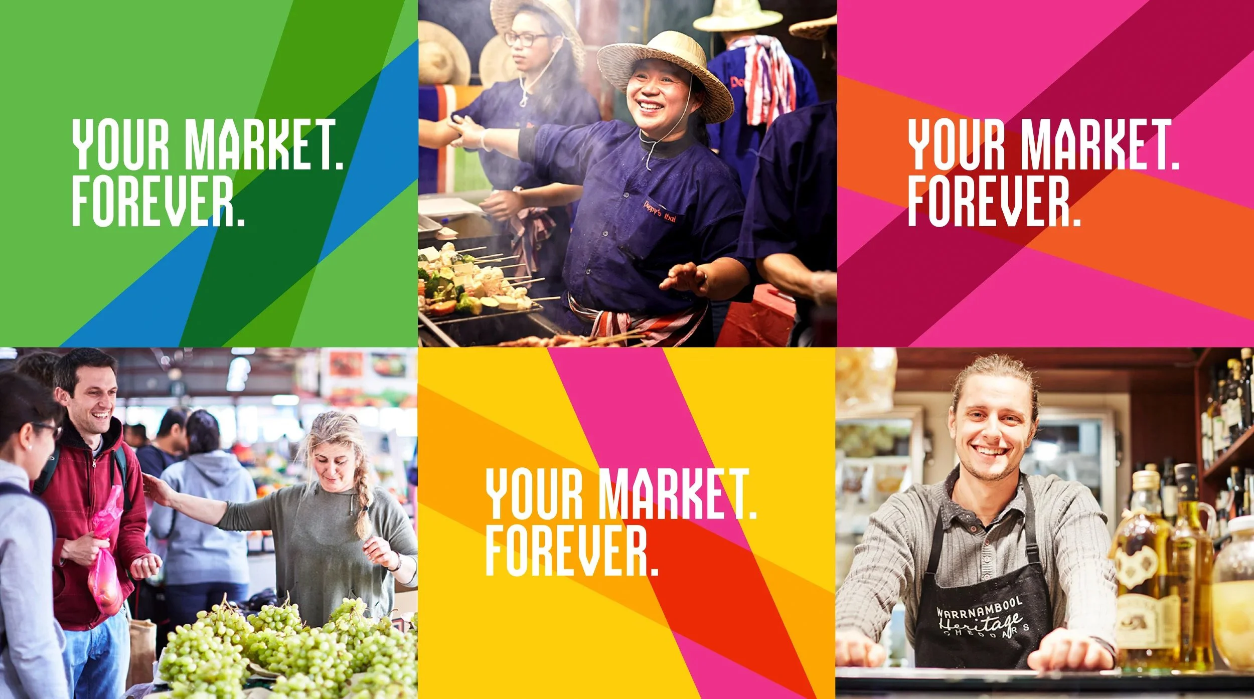
The revitalised brand creates pride, loyalty, and exploration, positioning Queen Victoria Market as Melbourne’s iconic, culturally immersive, emotionally resonant destination.

SEE RELATED
LOVE WEST SIDE
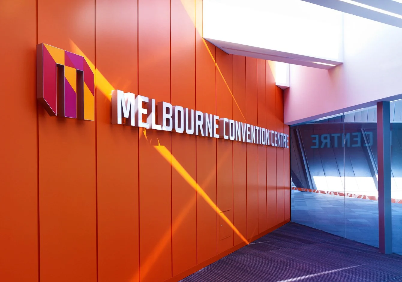
MELBOURNE CONVENTION & EXHIBITION CENTRE